Money Super Market
Money Super Market motor emails
Following a brand refresh of Money Super Market in 2019, I took on the expanded role within the group to be the CRM lead for the Motor, Insure and Energy channels. The leading channel being motor as it is the company's biggest earner.
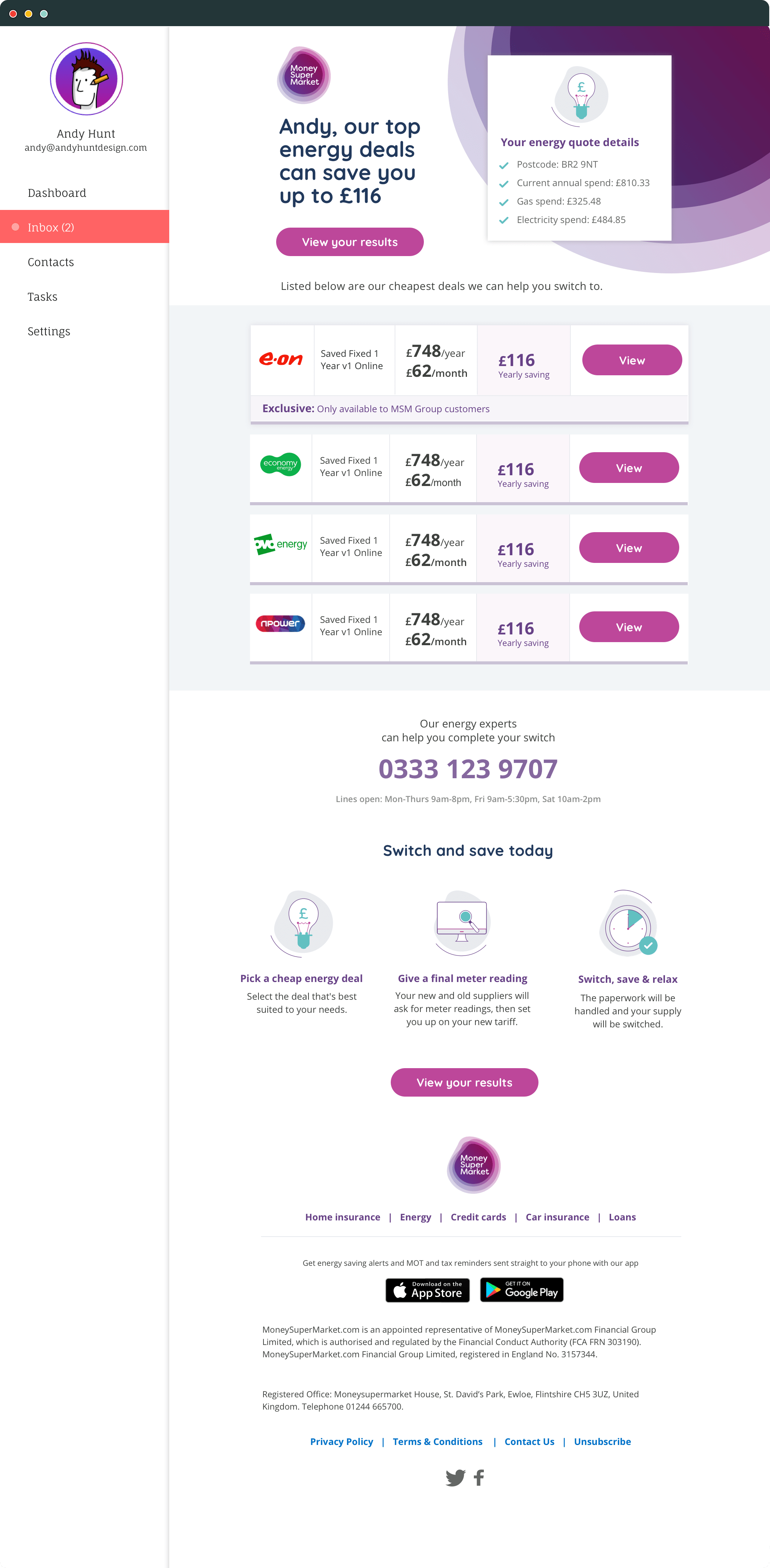
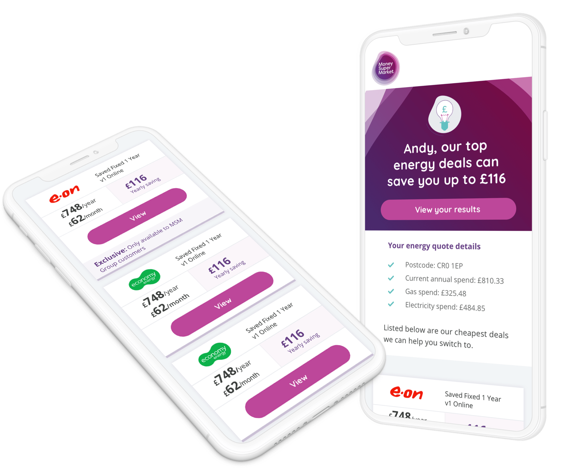
I took charge of updating the look and the usability of the entire motor journey, form when a customer runs a query, through the onboarding process, right through to the monitoring of better deals on the market. Each templated was highly complex being dynamic with the content driven from data. New campaigns were always springing up, so I have listed out the journey for the rebranded moto journey. See the energy journey for the rebranded energy campaigns.

MONEY SUPER MARKET
Motor instants
The motor instant would be sent to the user once they have run an enquiry on the motor page on site.
This is a hugely complex and dynamic template which handles data coming in upstream filters through the provider, price break down and if any offer is involved. The email was heavily tested during the rebrand to reduce any impact on finances due to how important the campaign is.
A tabular list was added along with a more sophisticated, responsive view which helped boost the email with an annual uplift of over £1m.

MONEY SUPER MARKET
Onboarding
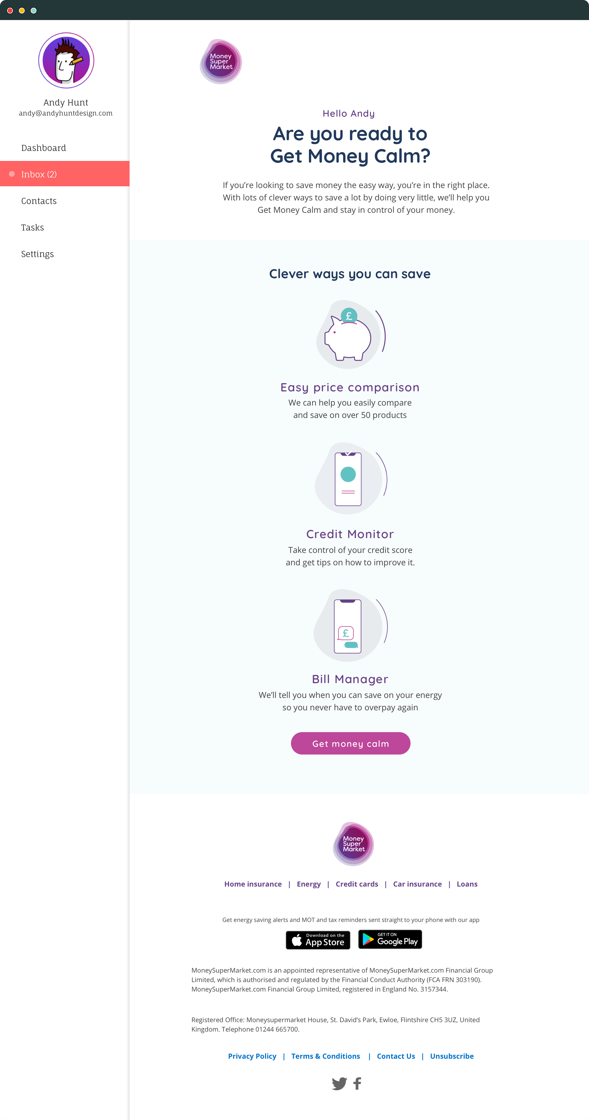
Depending on how the user came to the site, there were six different welcoming emails, which including a follow up prompting a discarded enquiry to finish registration.
The journey split depending on which channel the user entered and whether the customer is ‘generic’ or ‘considering’.
MONEY SUPER MARKET
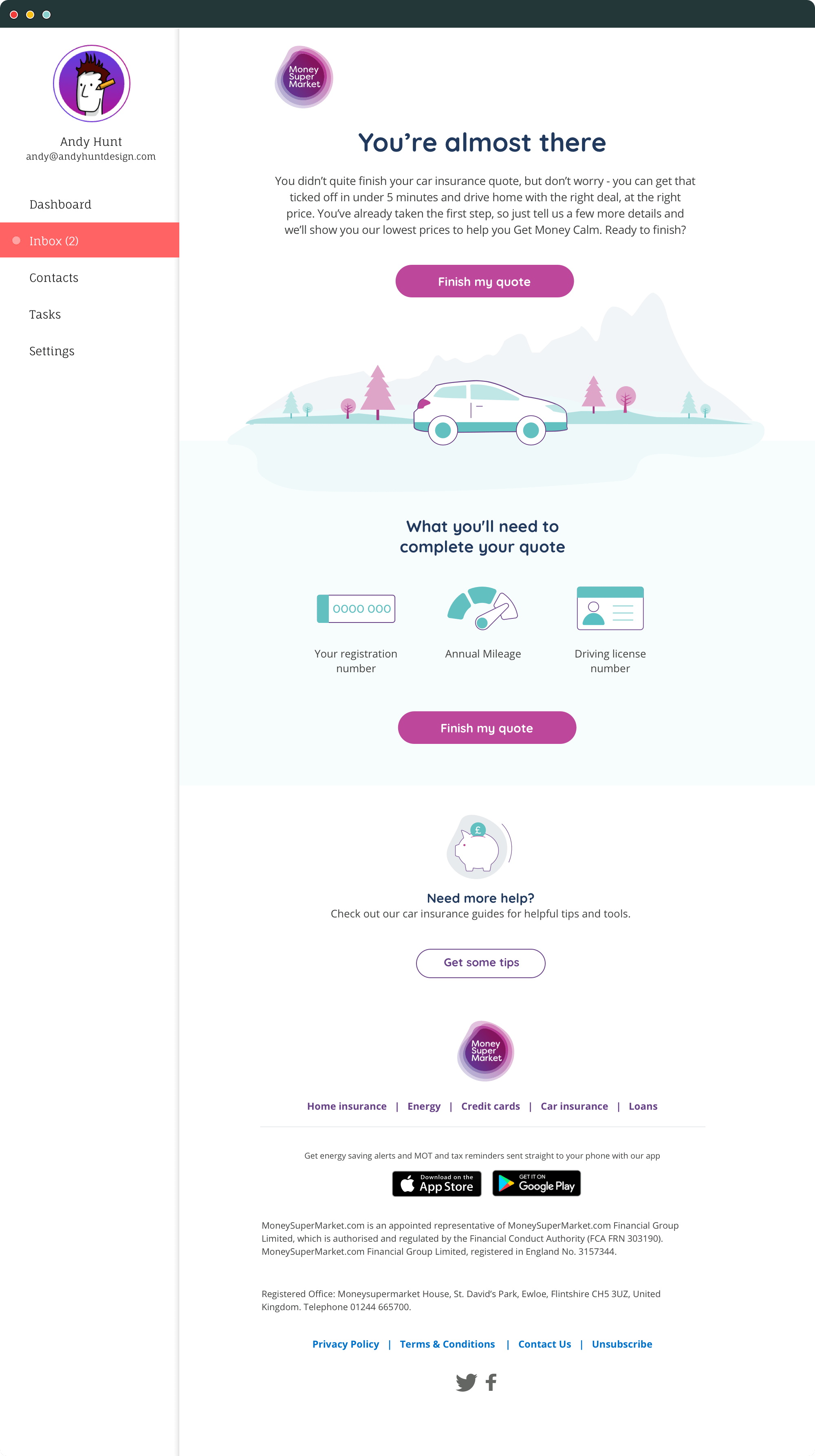
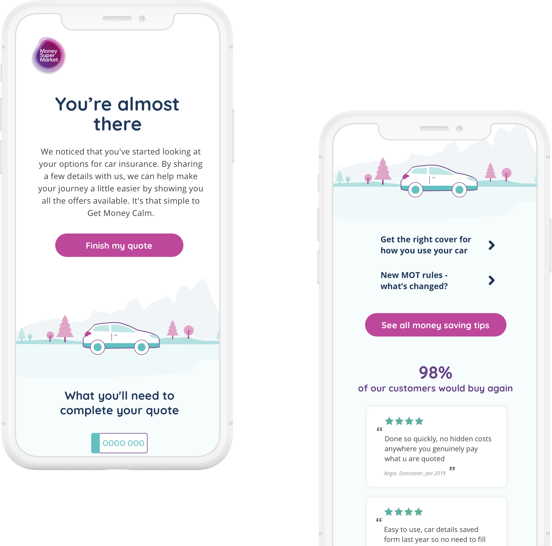
Abandon Browse
A two tiered abandon browse mail out based on what level of information was entered – one from the start of the checkout and one near the end.
MONEY SUPER MARKET
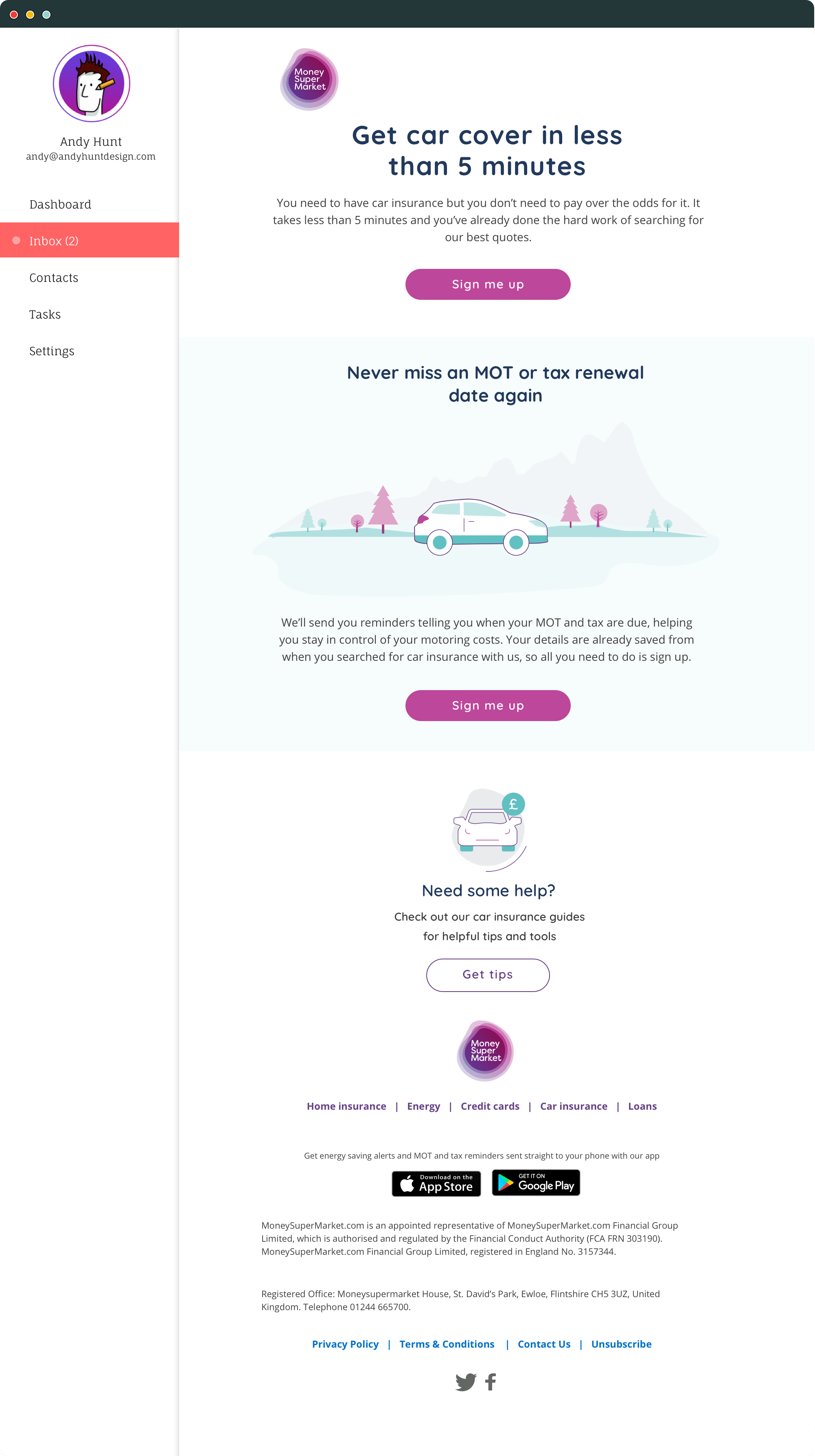
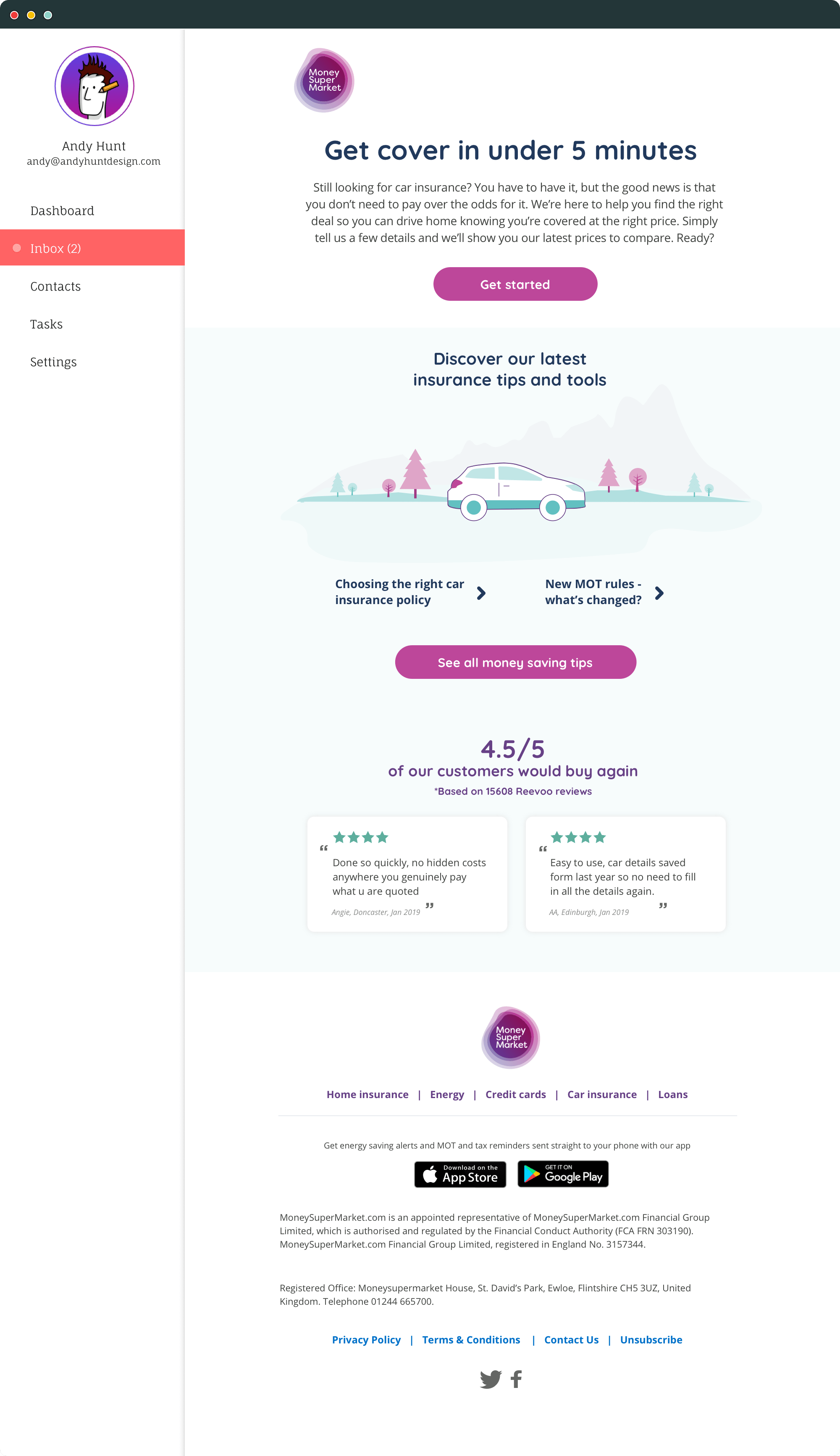
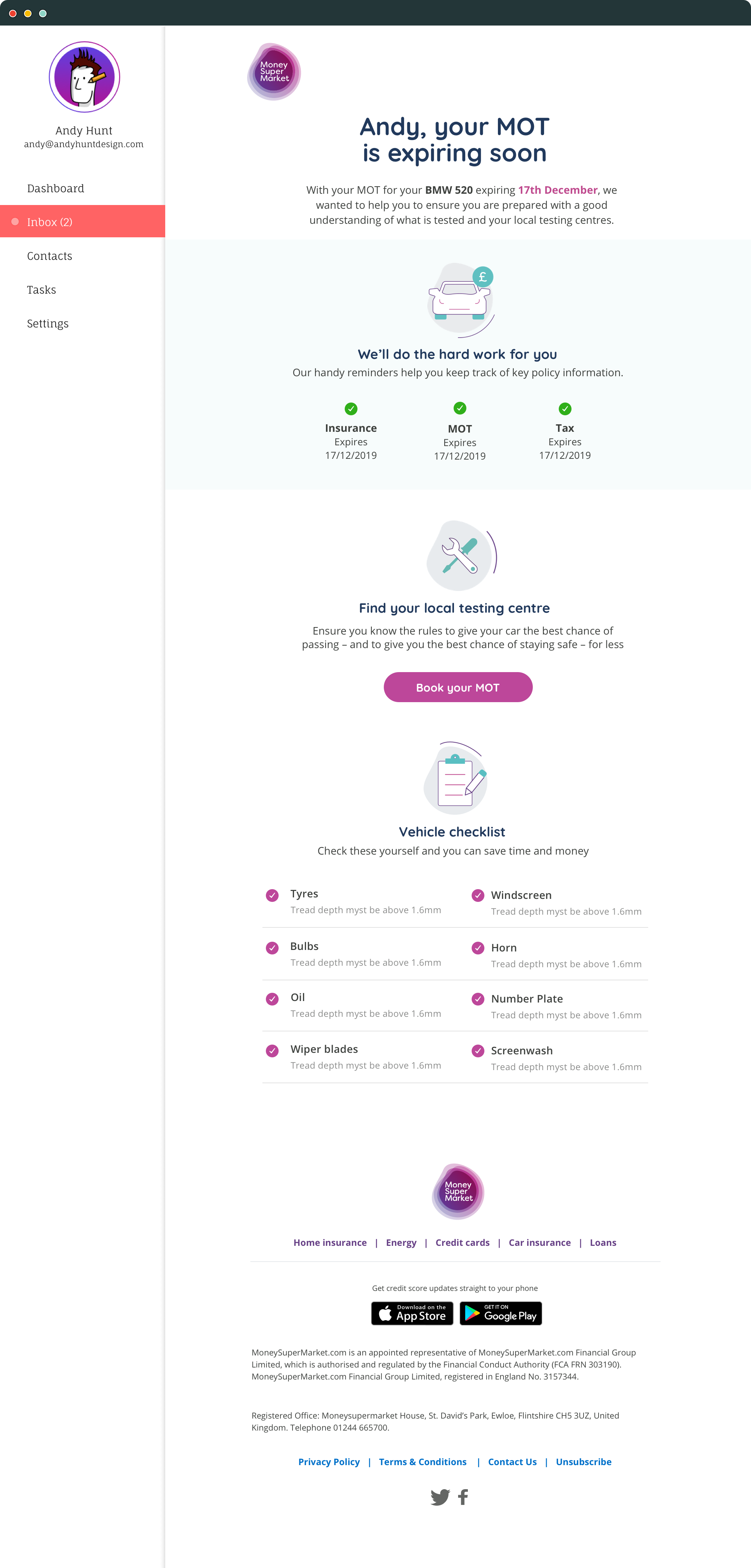
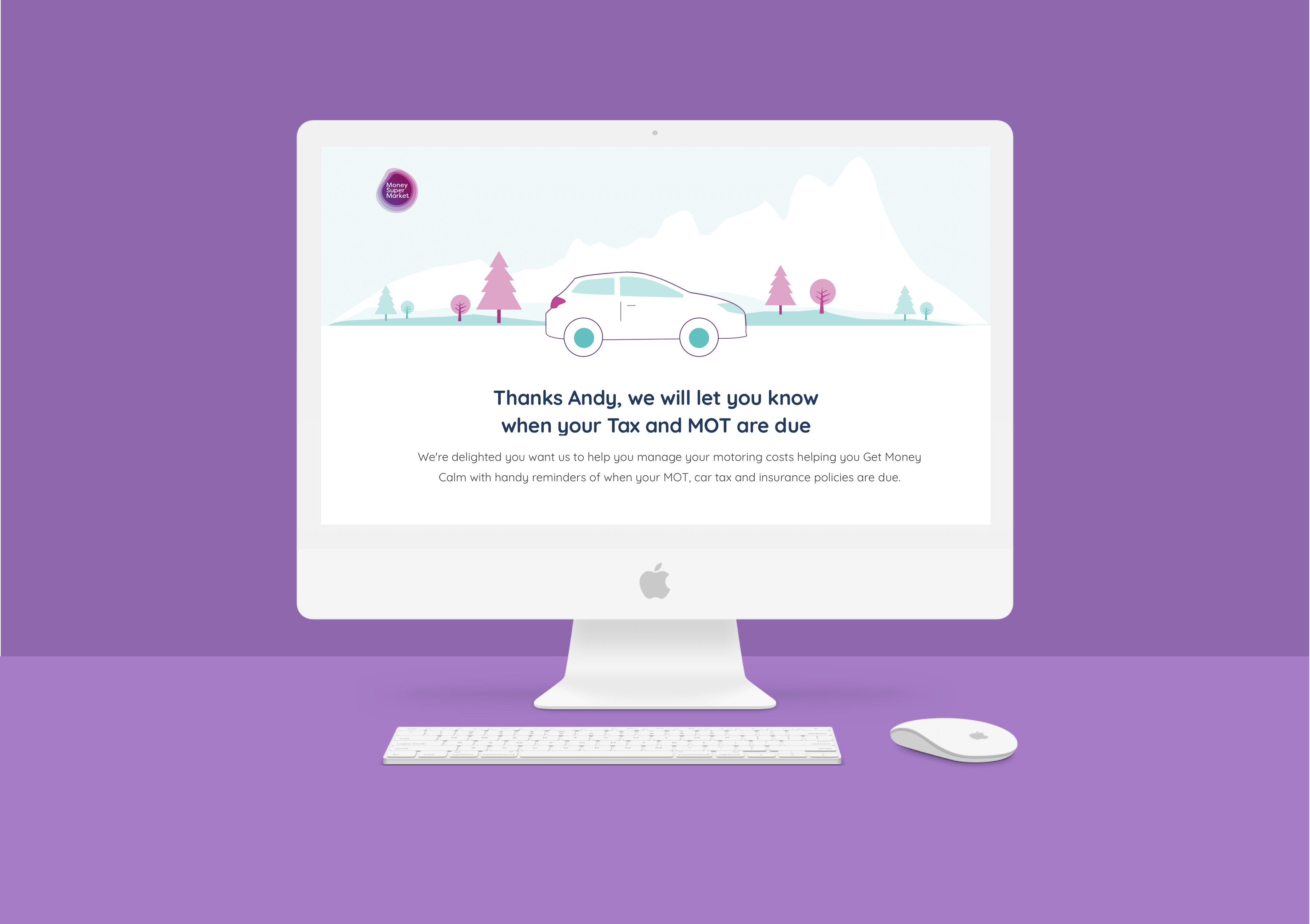
MOT and Tax Alerts
Money Super Market set up a reminders for renewing MOT and tax, starting with an email out. The data collected were put into complex templates which filtered through all aspects of the MOT and tax expiration
These alerts formed the basis for their inclusion into the monthly roundup emails.

MONEY SUPER MARKET
Establishing iconography
The new brand meant a update to the icons, which were starting to look dates.
The new icons marry up web, email and app to keep a consistent story through the experience.

The results
The website redesigns saw a slight increase in engagement against the older site when both were switched on. Once the redesigned rolled out it performed it significiantly better. The onboarding email saw click through rate jump from 2% up to 35, with the optimisations made the monthly update also seeing higher levels of engagement.
GET IN TOUCH