Platform
Salesforce
Categories
Money Saving Expert
Credit Club website and email campaigns
I joined Money Saving Expert in 2017 with the brief to update and improve performance of all the service and and campaign emails for Credit Club, and to establish a new website.
Initial designs all played off the darker blue pallet, but I was determined to introduce more colour to the experience which was avaialble off the green in the logo.

MONEY SAVING EXPERT
Creating the website
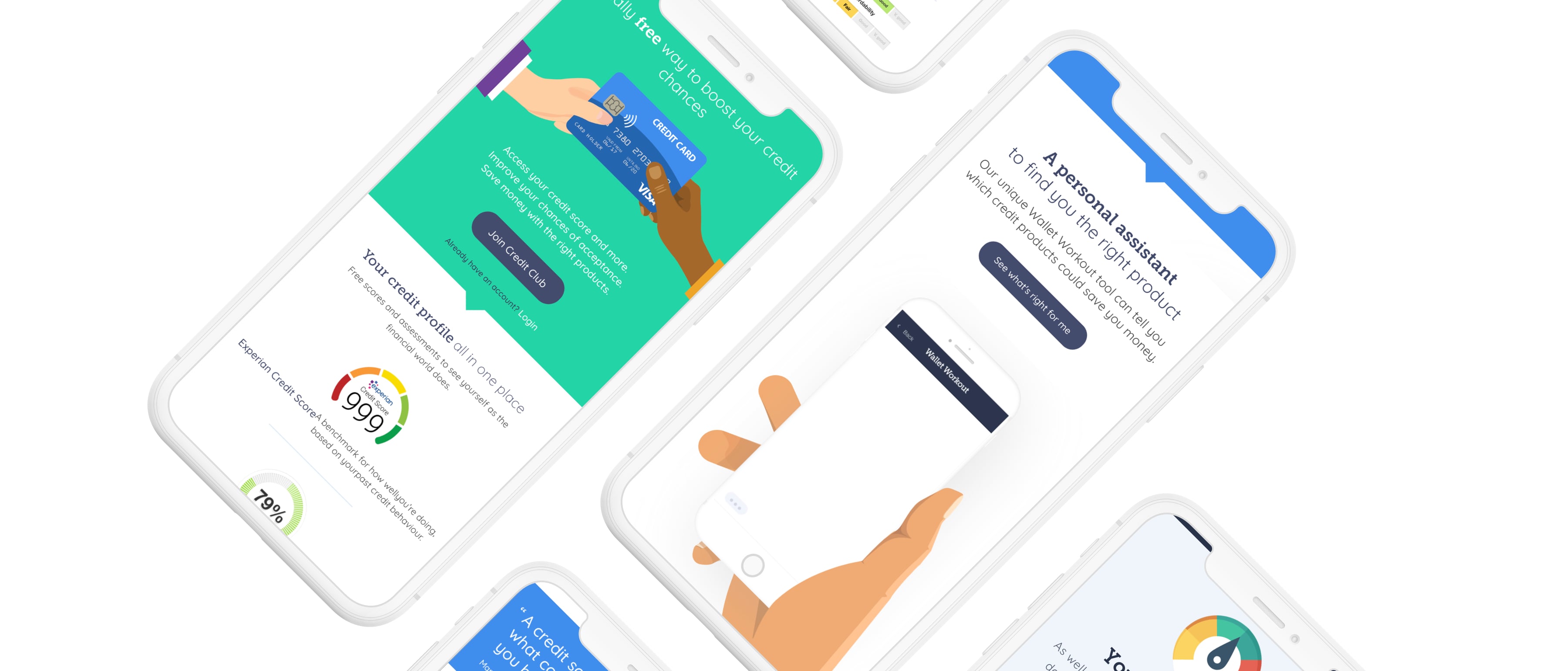
The website, despite being newly designed, was very dated and didn’t really engage a customer to the benefits.
The concept was placed into an A/B test and won – just! Once rolled out, the overall performance improved dramatically.


MONEY SAVING EXPERT
A more effective onboarding
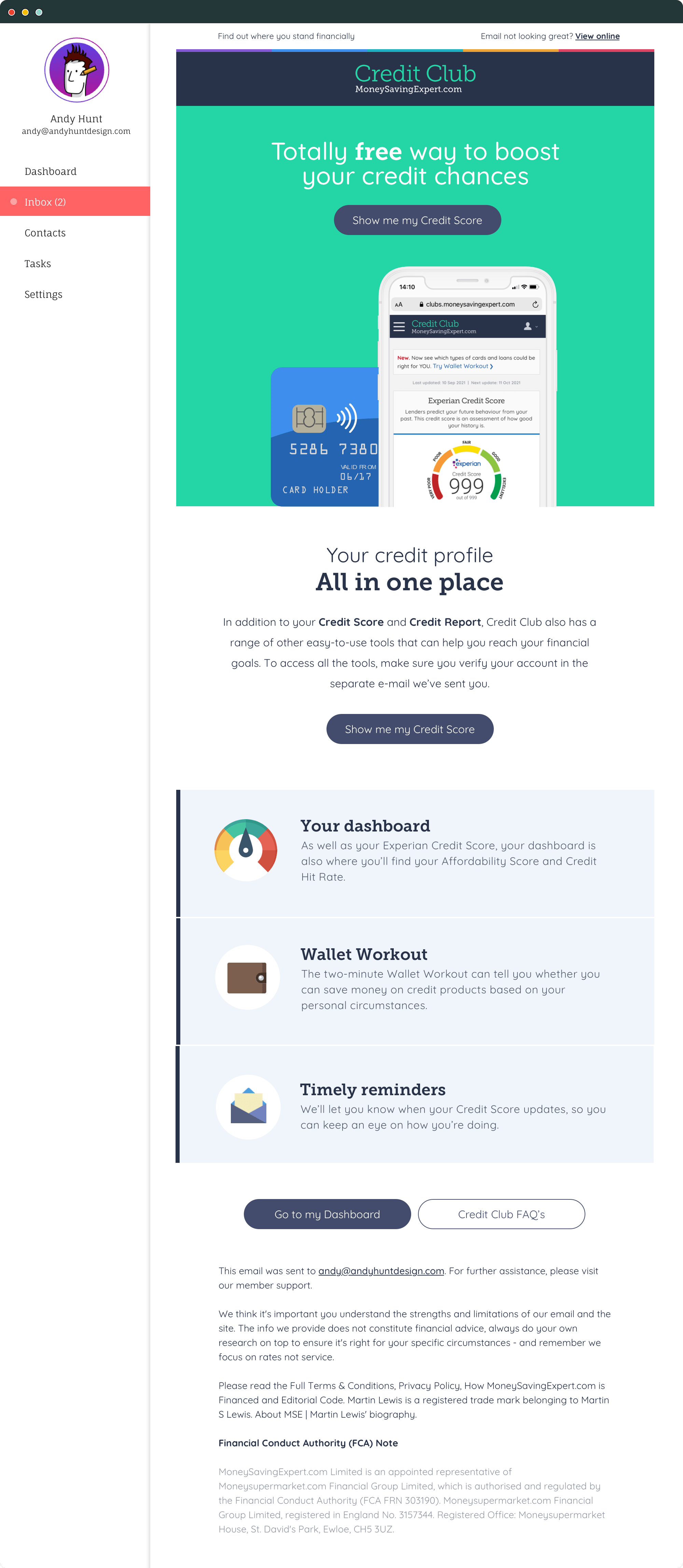
The original onboarding emails had minimal information for engagement and only one link which amounted to the call to action.
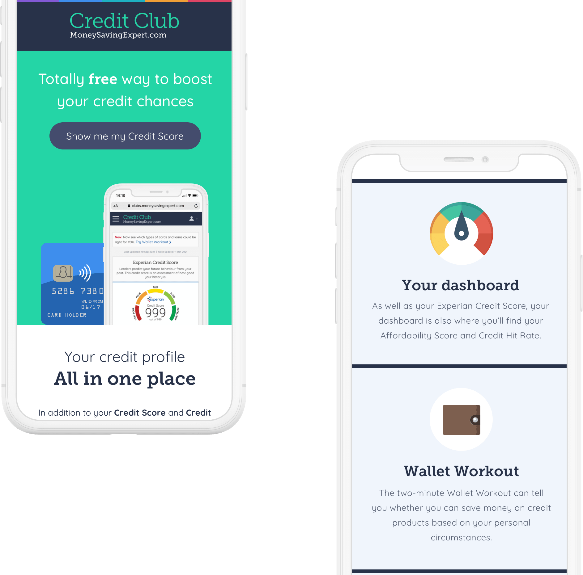
The new look established with the website was brought into the emails.


The results
The website redesigns saw a slight increase in engagement against the older site when both were switched on. Once the redesigned rolled out it performed it significantly better. The onboarding email saw click through rate jump from 2% up to 35, with the optimisations made the monthly update also seeing higher levels of engagement.
GET IN TOUCH

